E43: Responsive Castle High School
Castle High School has an old school website: fixed-width, a “marquee” with sliding text, and vaguely superfluous color gradients:
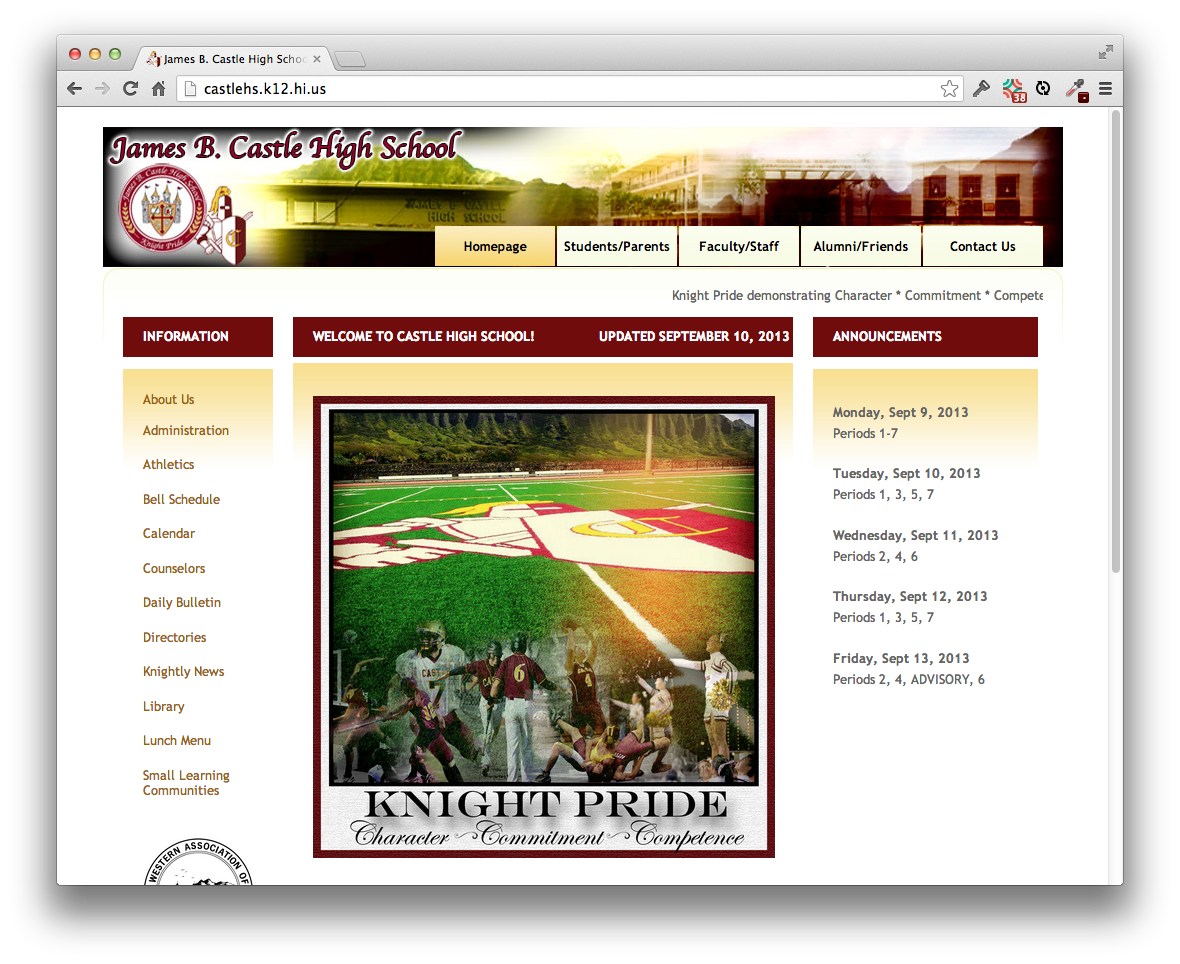
Be sure to take a moment and visit the Castle High School site as preparation for this WOD.
Let’s give them the beginnings of a website make-over using Twitter Bootstrap. We’ll keep the banner image, the three column layout, and the central picture. But we’ll make everything responsive and use a more modern “flat” design. Here’s what you should shoot for:
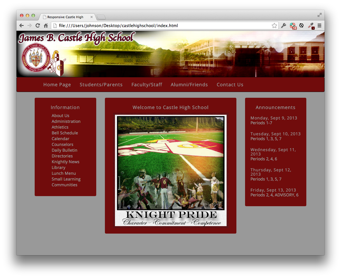
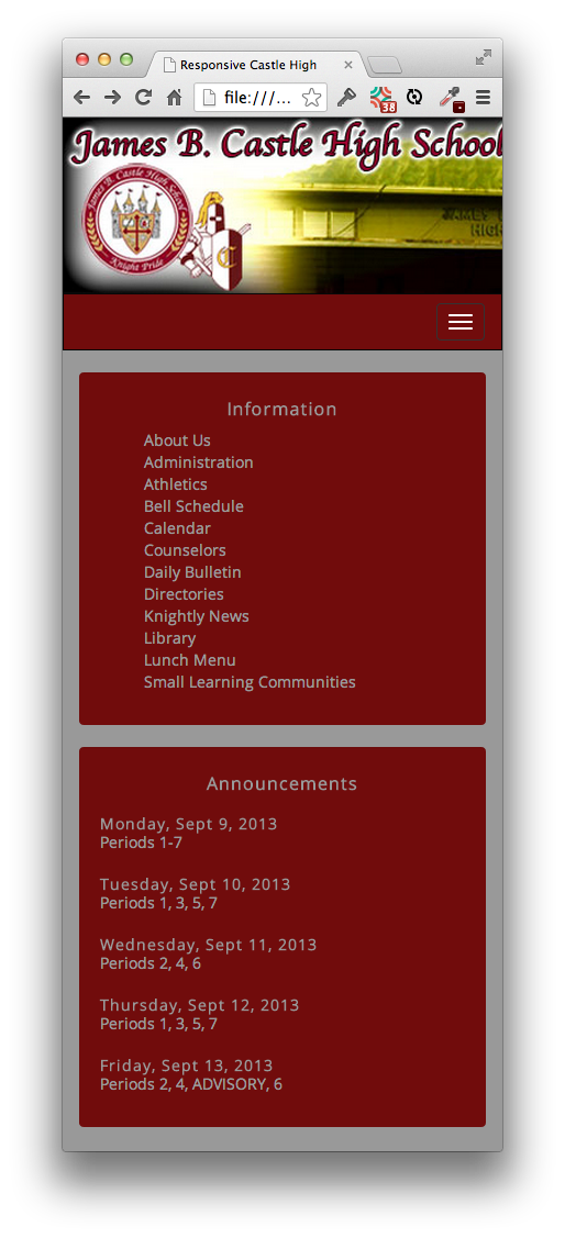
For this make-over, we’ll incorporate two colors from the original design: the red (#710C0C) and the gray (#999). We get rid of the marquee. For this prototype, we won’t include all the content from the home page, just the top parts of the three columns. Finally, to improve the usability, we’ll eliminate the center section entirely from the mobile layout:
Instructions
-
Start your timer.
-
Create a GitHub repo called responsivecastlehigh, clone to your laptop, and create an IntelliJ project in that directory called responsivecastlehigh.
-
Base your design on the bootstrap-example-intro basic template.
-
Use Open Sans and the gray color (#999) for all text.
-
Put the Castle High School banner image at the top of the page.
-
Below the banner image, put the navbar. Make the navbar background red and the text gray.
-
Set the navbar link names to those from the real site, and make them 16px.
-
Make the background of the entire page gray.
-
Below the navbar, put three columns, each in a well: a col-md-3 “Information” column, a col-md-6 “Welcome to Castle High School” column and a col-md-3 “Announcements” column. Make the background red and the text gray.
-
Add 12 link labels taken from the real site to the Information column, make them gray, and remove the bullet (i.e. set list-style-type to none).
-
Add the Knight Pride image to the middle column. Use height: 400px; background-size: contain; background-repeat: no-repeat; background-position: center.
-
Add the period schedule to the Announcements column. Adjust fonts and spacing to look good.
-
Set the middle section to be hidden at mobile screen sizes. (Hint: check the “Responsive Utilities” section of the CSS chapter of the Bootstrap documentation.)
-
Commit your version to GitHub.
When finished, stop your timer, and record how many minutes it took you to complete the WOD.
Rx: <30 min Av: 30-40 min Sd: 40-50 min DNF: 50+ min
Demonstration
Once you’ve finished doing the WOD a single time, watch me do it:
Standard WOD Caveats
You’ll learn significantly less from watching me solve the WOD if you haven’t attempted the WOD yourself first.
While it’s an achievement to finish the WOD no matter how long it takes, you might experience “diminishing returns” if you work longer than the DNF time. Thus, it is usually strategic to stop working at the DNF time and watch my solution.
After watching my solution, I recommend that you repeat the WOD if you have not achieved at least Av performance. If so, be sure to:
- Start a new branch off master to hold the new attempt, or else delete your prior attempt so you cannot refer to it;
- Don’t look at my screencast while you WOD; and
- Reset your timer.
Feel free to keep trying until you make Rx if that’s of interest to you.