Page Design for RadGrad
For this experience, you will start envisioning the user interface to four pages in the RadGrad system. For now, don’t worry about adhering to every last Material Design principle, but rather to simply get the general “vibe” of the page and what it should accomplish. There are at least two ways to do this mockup: LucidCharts or Paper.
LucidChart mockup
Apply for a LucidChart Educational Upgrade which gives you access to the “Wireframe” chart objects. You can then create your pages in LucidChart. Here’s an example of a partially created landing page:
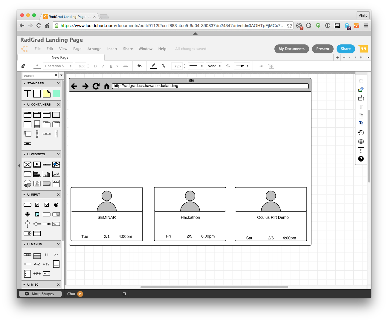
This representation is good for sharing, but the tool can distract you from thinking about the actual interface, and it psychologically restricts you to the objects in its palette.
Paper mockup
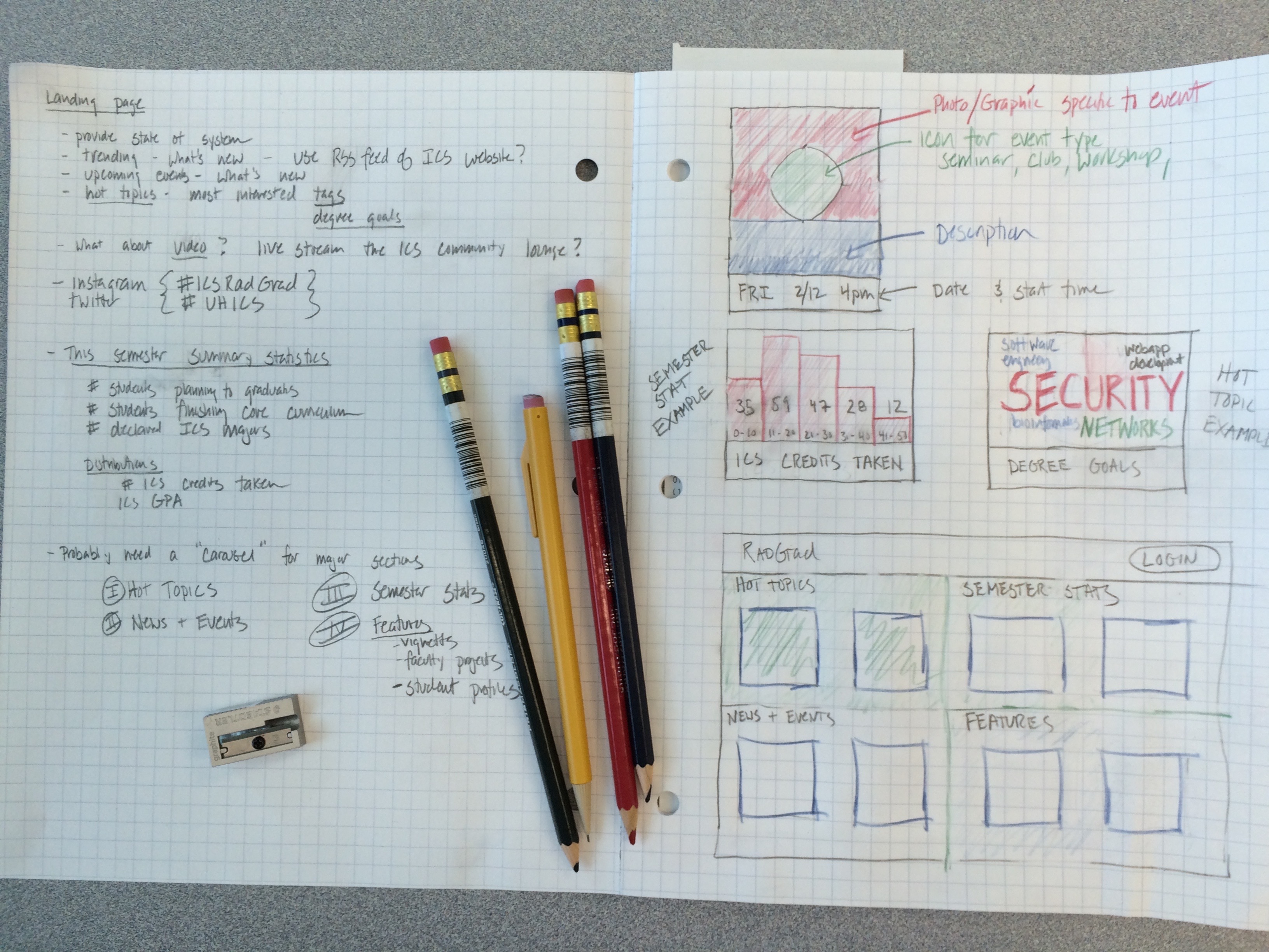
Rather than Lucid Design, I recommend that you create your initial design ideas using paper and pencil. More specifically, using graph paper and colored pencils.
I went to campus center and spent six dollars to buy a pad of graph paper ($3.00), three colored pencils ($0.85 each), and a sharpener ($1.30). Here’s what I produced after working on the landing page for about 30 minutes:
A few things to note:
- I used one side to jot down ideas, the other side to draw UI element ideas.
- The idea of using a Word Cloud to show degree goal popularity would probably not have occurred to me in Lucid Charts, since they don’t provide that as a built-in UI element.
- My design focus was more bottom-up than in Lucid Chart. Rather than drawing a screen and trying to fill it in with boxes and circles, I started thinking about what information I wanted to communicate, then trying to create an element to communicate a specific bit of information, then thinking about how to present those elements on the page.
- Paper and pencil allows you to go back and forth between a visual design (on the right page) and notes (on the left). I found myself rapidly switching back and forth between “why” and “what” (left side) and “how” (right side). Lucid Charts kind of constrains your thinking to “how”.
- You might also want to buy an eraser. I was really giving mine a workout.
Pages to design
Regardless of what medium you choose to design in, your task is to come up with one or more example page designs for the following areas of RadGrad:
1. Landing page
The landing page is the page first displayed when a user navigates to the site and before they login. When displayed on a large screen, it should provide capabilities like the billboard. When displayed on a laptop, it should still provide an informative insight into the state of the department and the degree program.
The landing page is not intended to explain the site to users. It should present reactive data sources, so its display should change over time without refreshing. Think about the kinds of information that provide insight into the department, and think about ways to display it that help users understand where we are and (hopefully) where we are going.
2. Home page
The page presented to a user after successful login is called the “home page”. This page provides a helpful summary of the user’s current state.
Suggestions for what might appear on the home page appear in the dashboard. However, do not limit yourself to these suggestions. Take a look at MyEdu or STAR for other ideas.
3. Degree planner page
The Degree Planner page should enable the student to display the courses they have taken, plan the courses they want to take in future, and enable the system to critique their selections and/or provide predictions.
There is no “recommendations” or “predictions” page in RadGrad. Instead, “recommendations” and “predictions” appear in context–whereever they add value to the other information displayed on the page.
The Degree Planner page should be “smart”; it should understand course prerequisites, degree goals, and how they should influence the choice of courses. However, the system should not prevent a student from making a choice. At worse, it might outline a selection in red to indicate some sort of problem.
4. Profile page
The profile page enables a student to provide information about themselves and customize the system to their liking. Additional information is provided in the Profile description.
While faculty and admins will also have profile pages, you can focus on the student profile for now.
Submission:
By the time and date specified on the schedule page, please:
- Create at least one design for each of the four pages.
- If using LucidChart, export your design as a png. If using paper and pencil, take a picture with your phone and upload the jpg.
- Write a technical essay in which you present your design for each page and provide a paragraph or two of explanation for each page design. Why did you include those elements? What elements did you decide not to include? What trade-offs did you make?
- Publish this technical essay in your professional portfolio.
- Post the link to your essay in the #technical-essays channel on Slack.